Partner feature
Dept. of Creatv’s and the art of the graphic layer
The Feen Edit looks at Dallas label Dept. of Creatv’s and the practical decisions behind a layered streetwear outfit that keeps its graphic readable.
Choose what the outfit is saying first
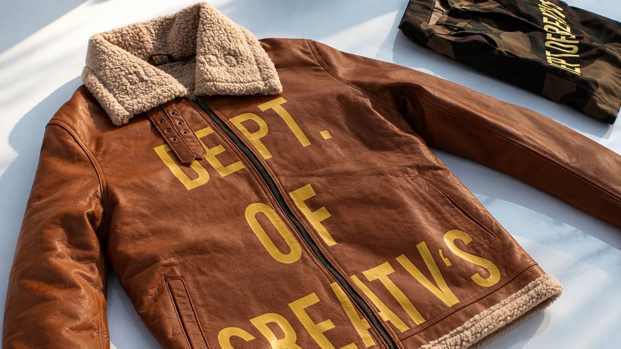
Layering can give streetwear depth, but it can also hide the reason you chose a piece. Dept. of Creatv's is a Dallas label built around limited graphic drops, vintage staples, and exclusive pieces. Its emphasis on graphic clothing offers a useful lens for deciding which part of an outfit should lead.
Before adding another layer, pick the focal point. It may be a large front image, a sleeve treatment, or the outline of a jacket. Check it standing naturally, with your arms where they normally fall. A composition that looks clear when clothing is carefully arranged can become crowded as soon as it is worn.
Think about overlap rather than matching everything
The edge of an open jacket creates a second frame around a tee. Ask whether that frame reveals the graphic or cuts through its most important area. If the top layer is the statement, let the underlayer provide contrast and space. Repeating every color is optional; making the hierarchy readable is more useful.
Length matters as much as color. A longer tee under a short jacket produces a different balance than two nearly identical hems. Try the layers separately as well as together. That makes it easier to see whether each piece has a purpose or whether one is only adding bulk to the image.
Keep the reference tied to the real item
For readers exploring Dept. of Creatv’s, the official site is the route to the label’s own identity and current channels. Review current garment measurements and product details there before making a purchasing decision. An editorial image can show an idea without confirming a piece’s current stock or fit.
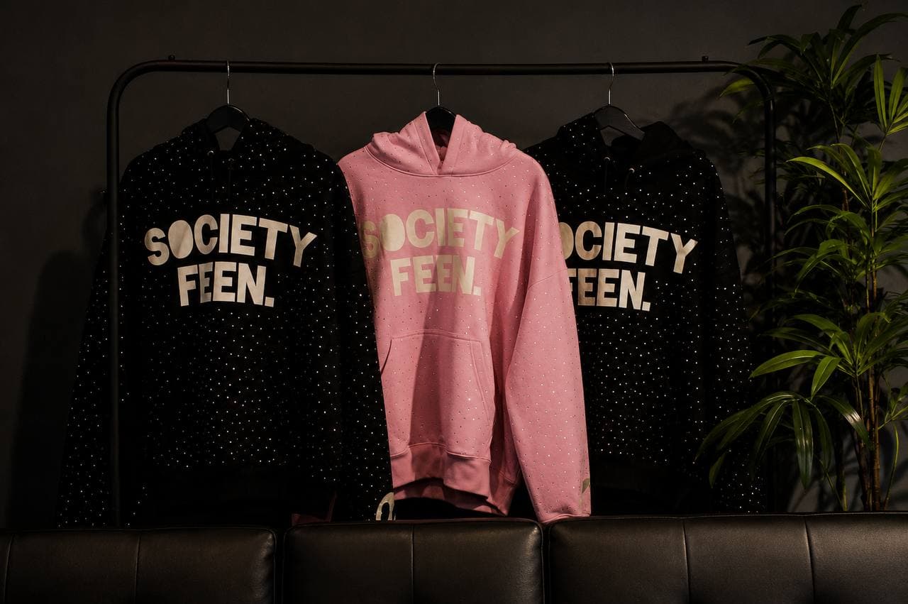
Society Feen’s hoodies, tees, and statement pieces occupy a related streetwear conversation while retaining their own design language. Looking closely at another IX Network label can refine a personal choice: one graphic, one supporting layer, and enough space for both to make sense. Try the combination in the setting where you expect to wear it, then remove anything that distracts from the part you wanted people to notice.
About this article
Published by the Society Feen Press Desk. Partner profiles draw on the subjects’ official brand descriptions; practical guidance reflects this newsroom’s editorial view.
Official references: Society Feen; Dept. of Creatv's.